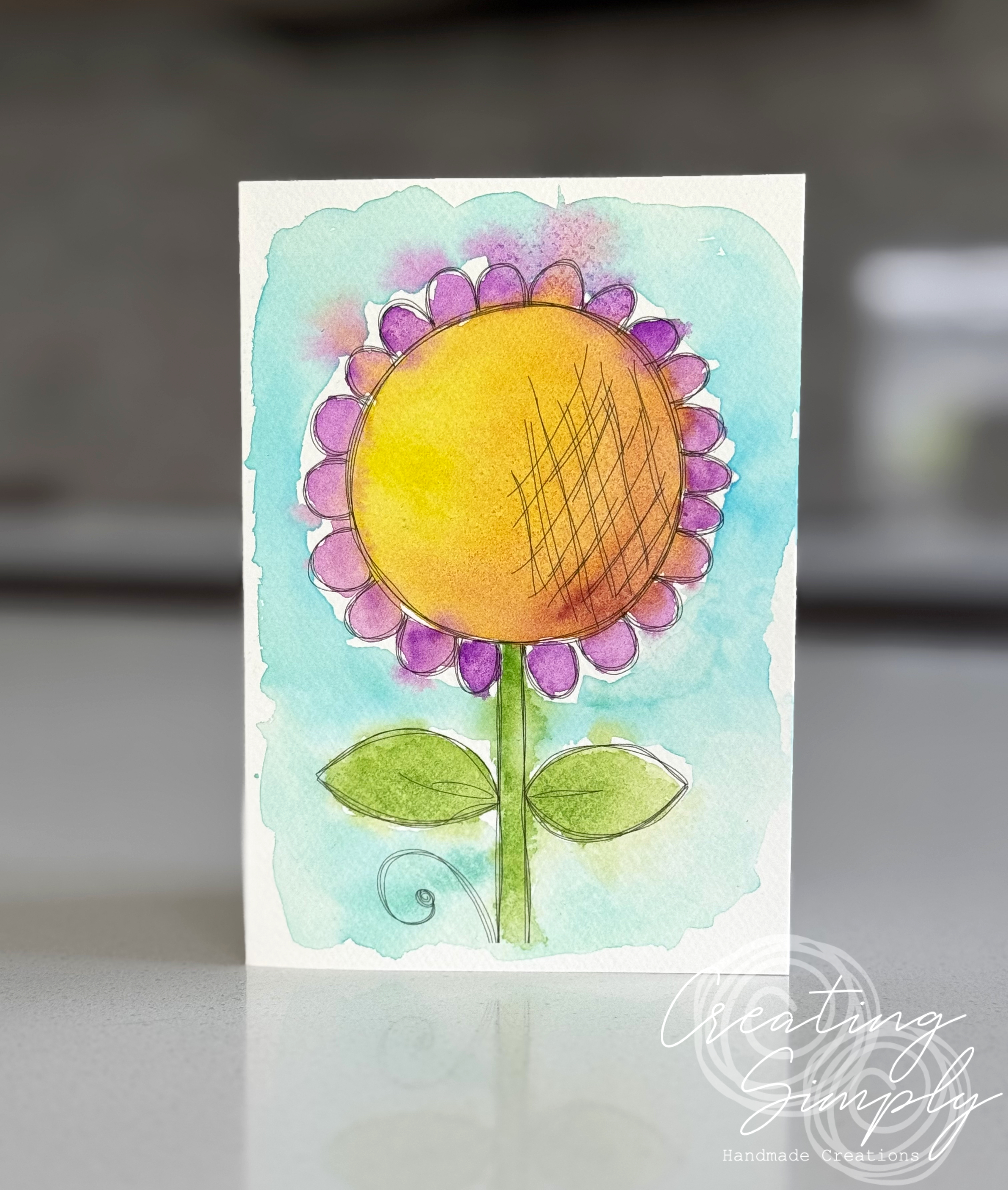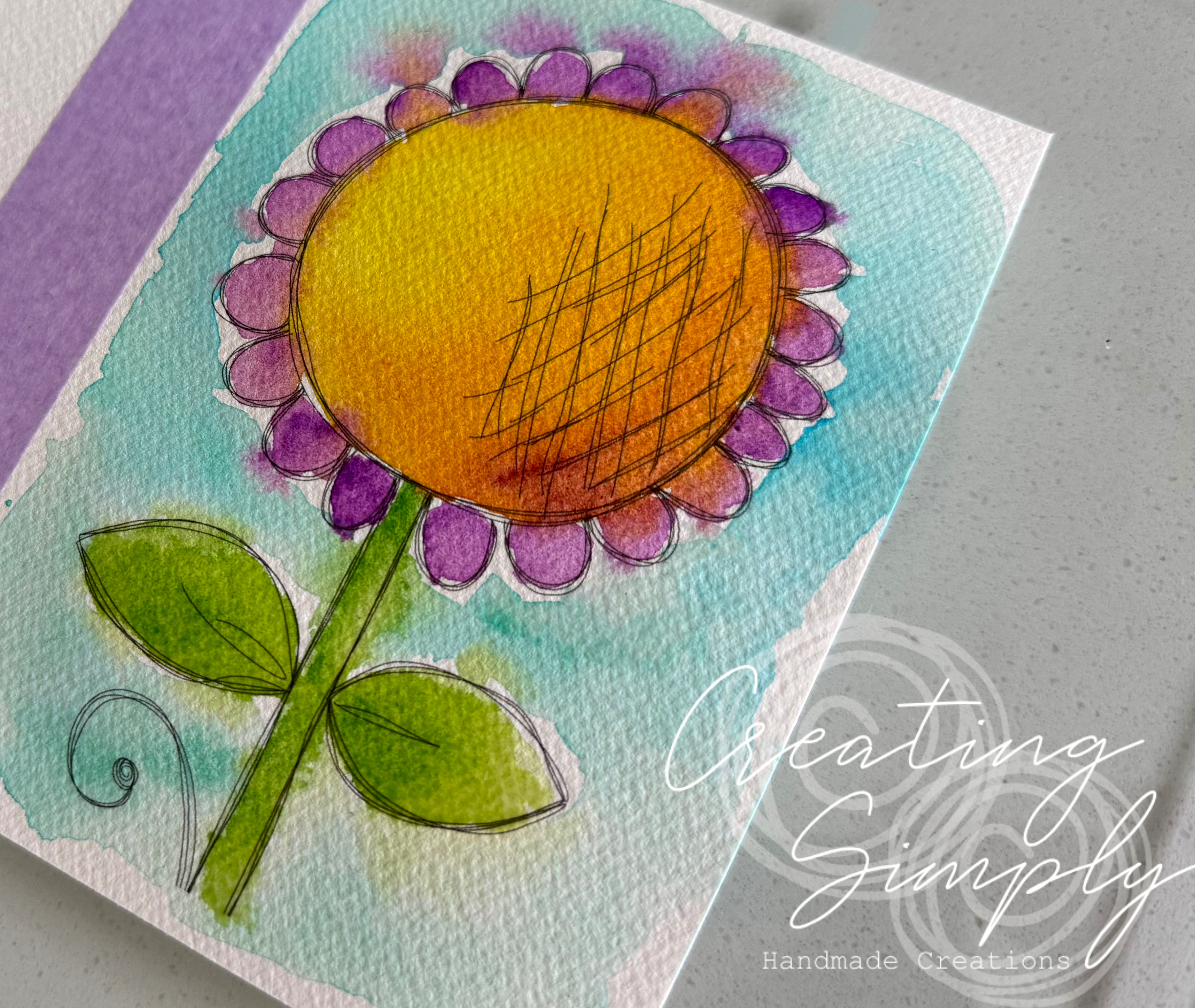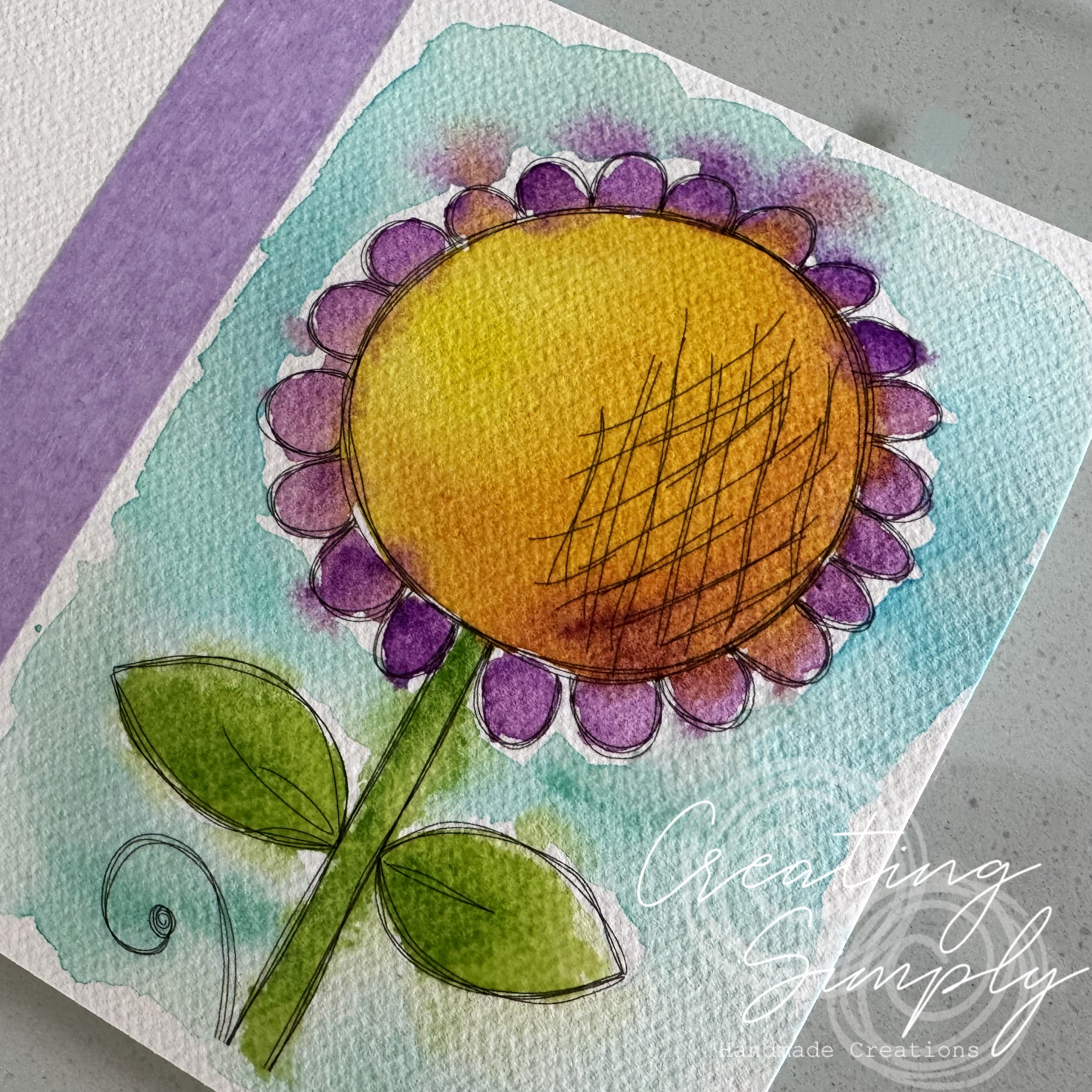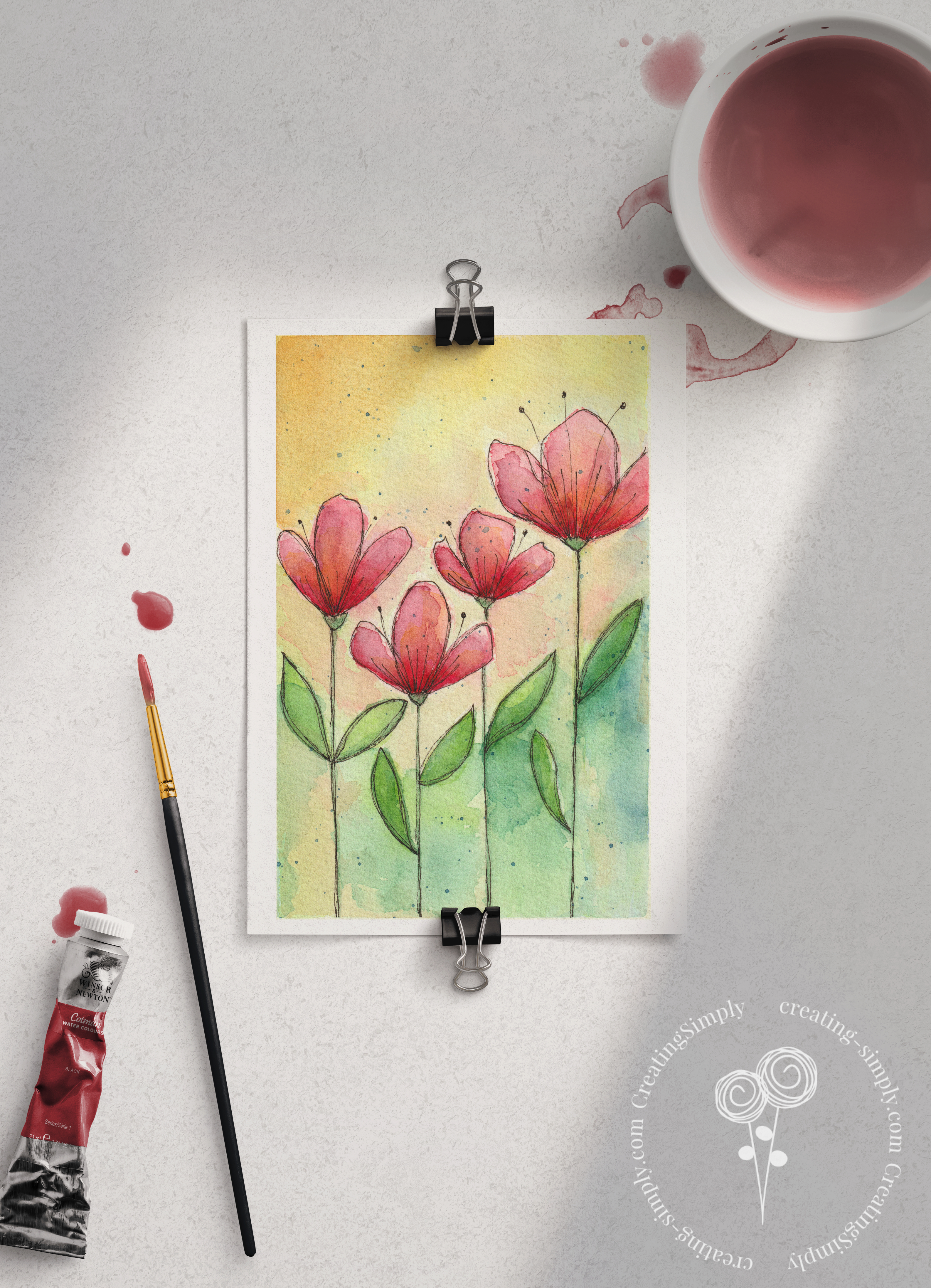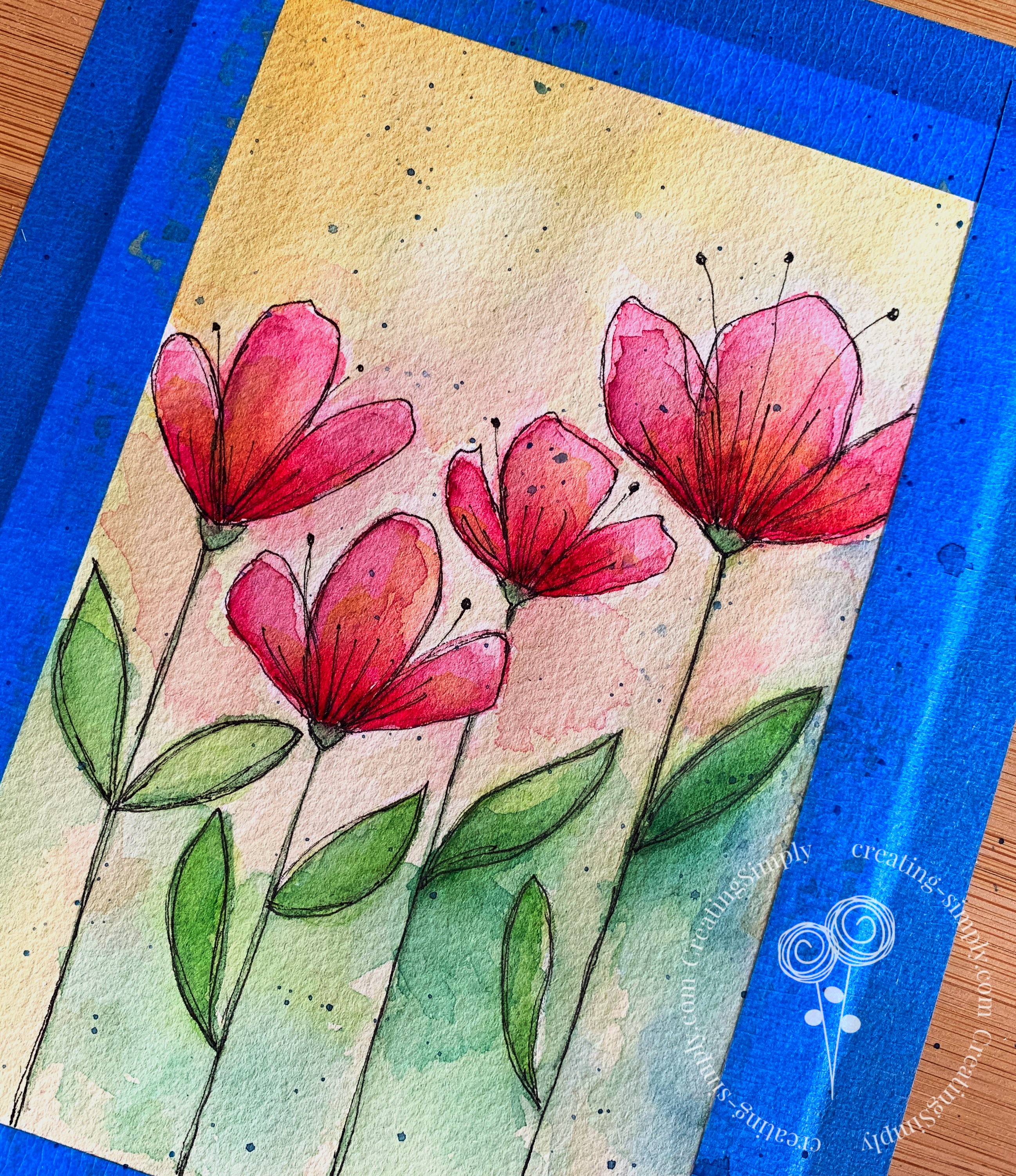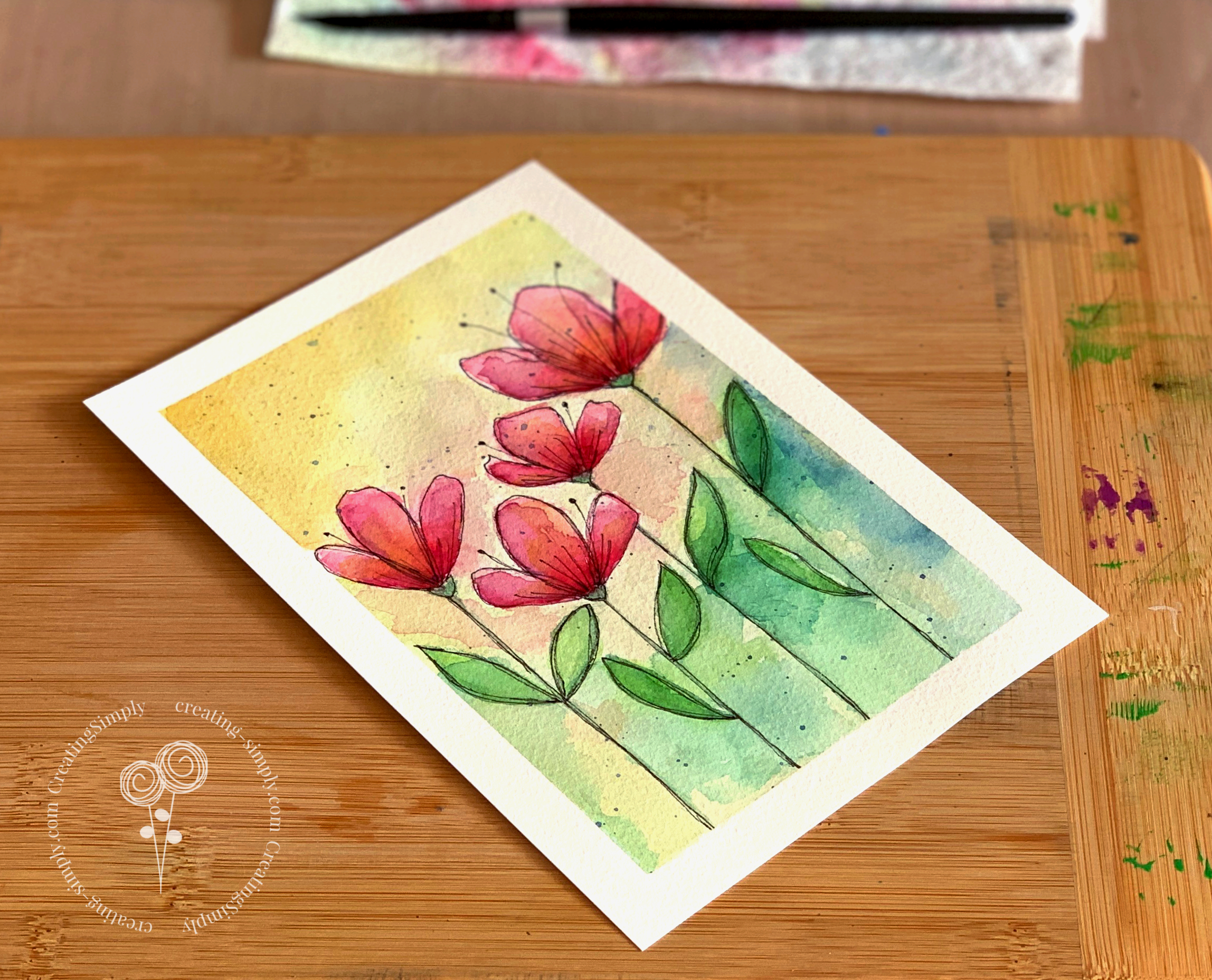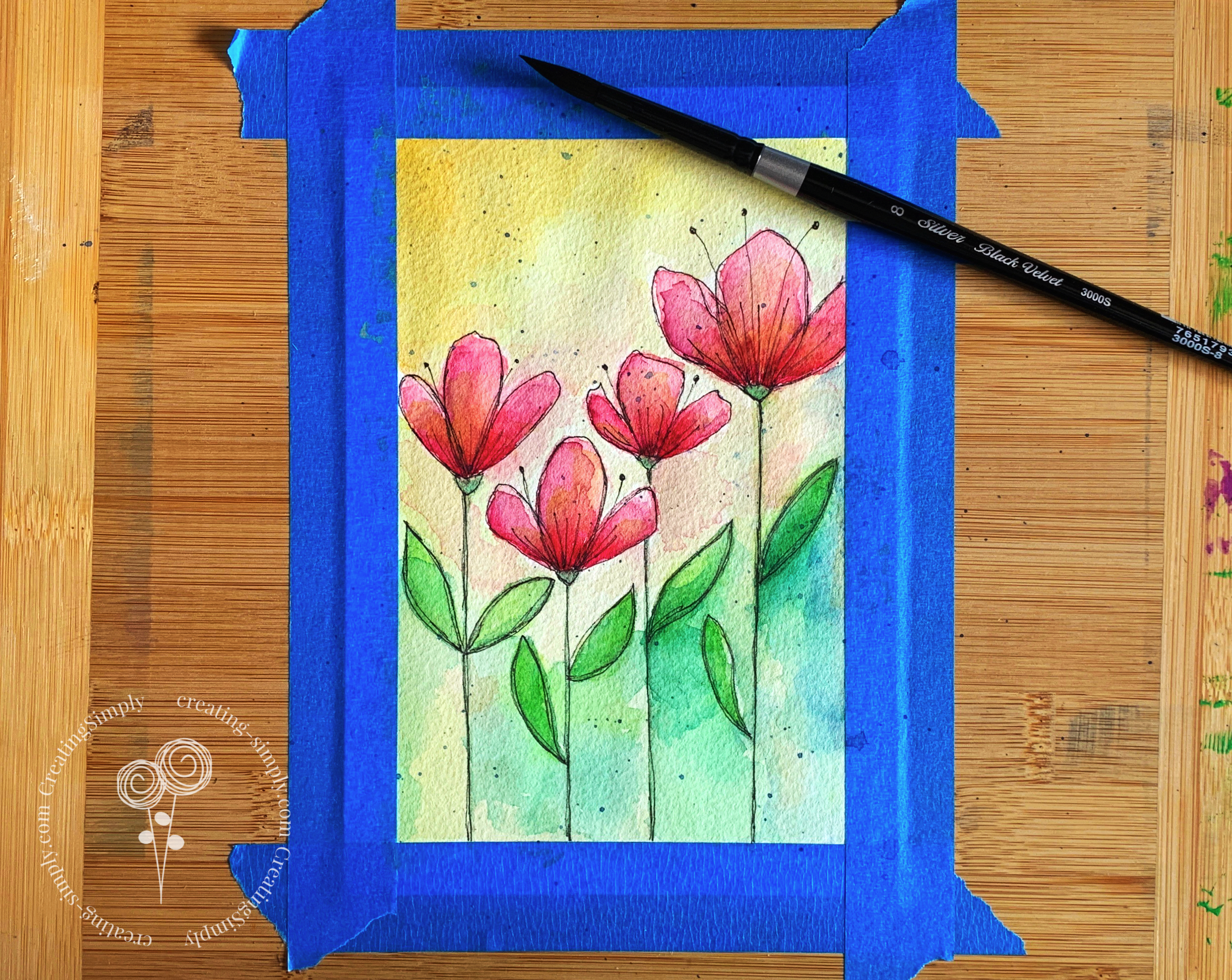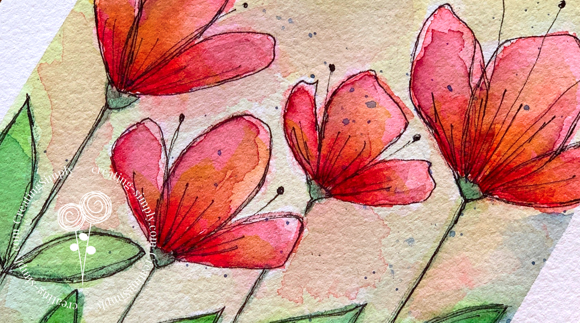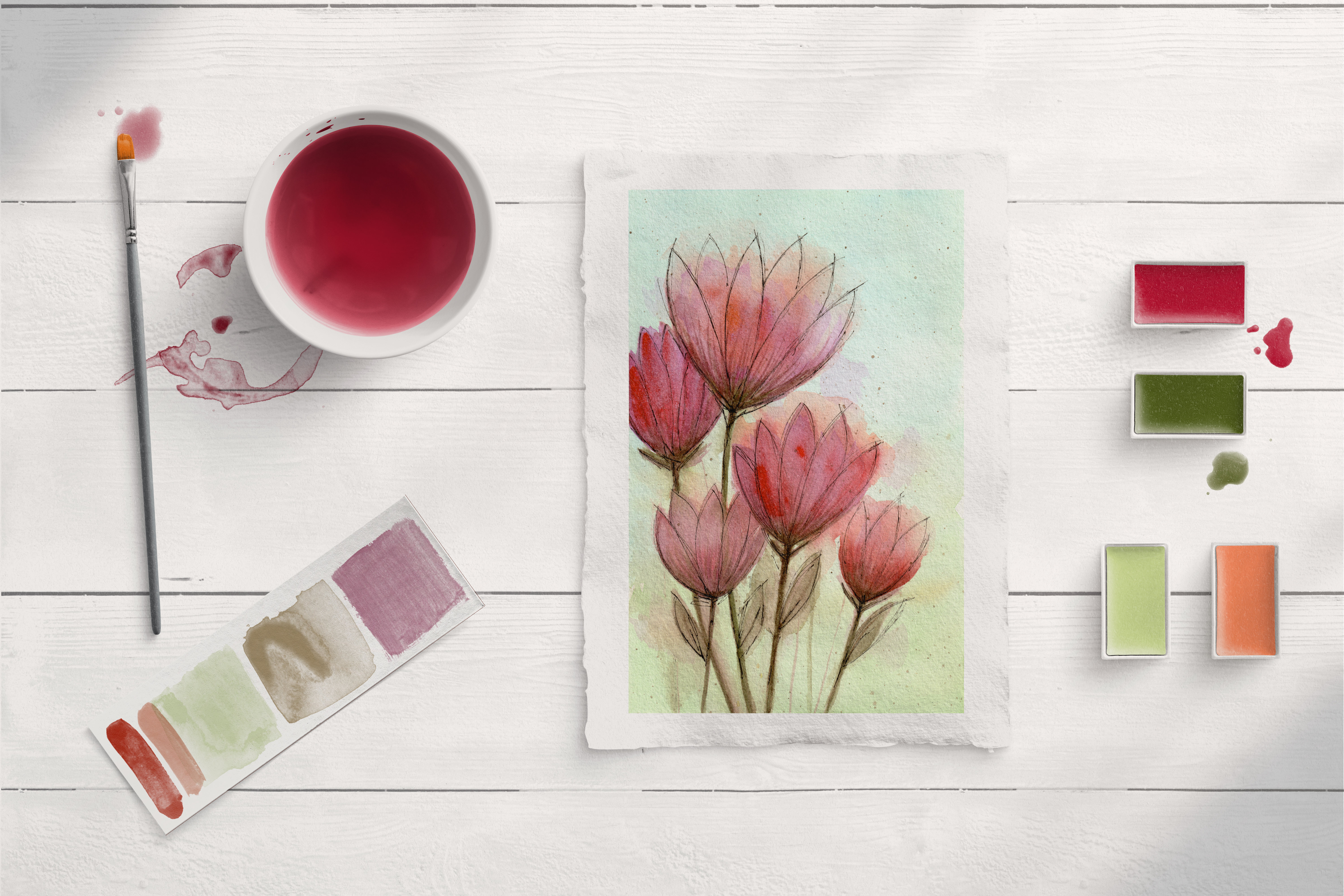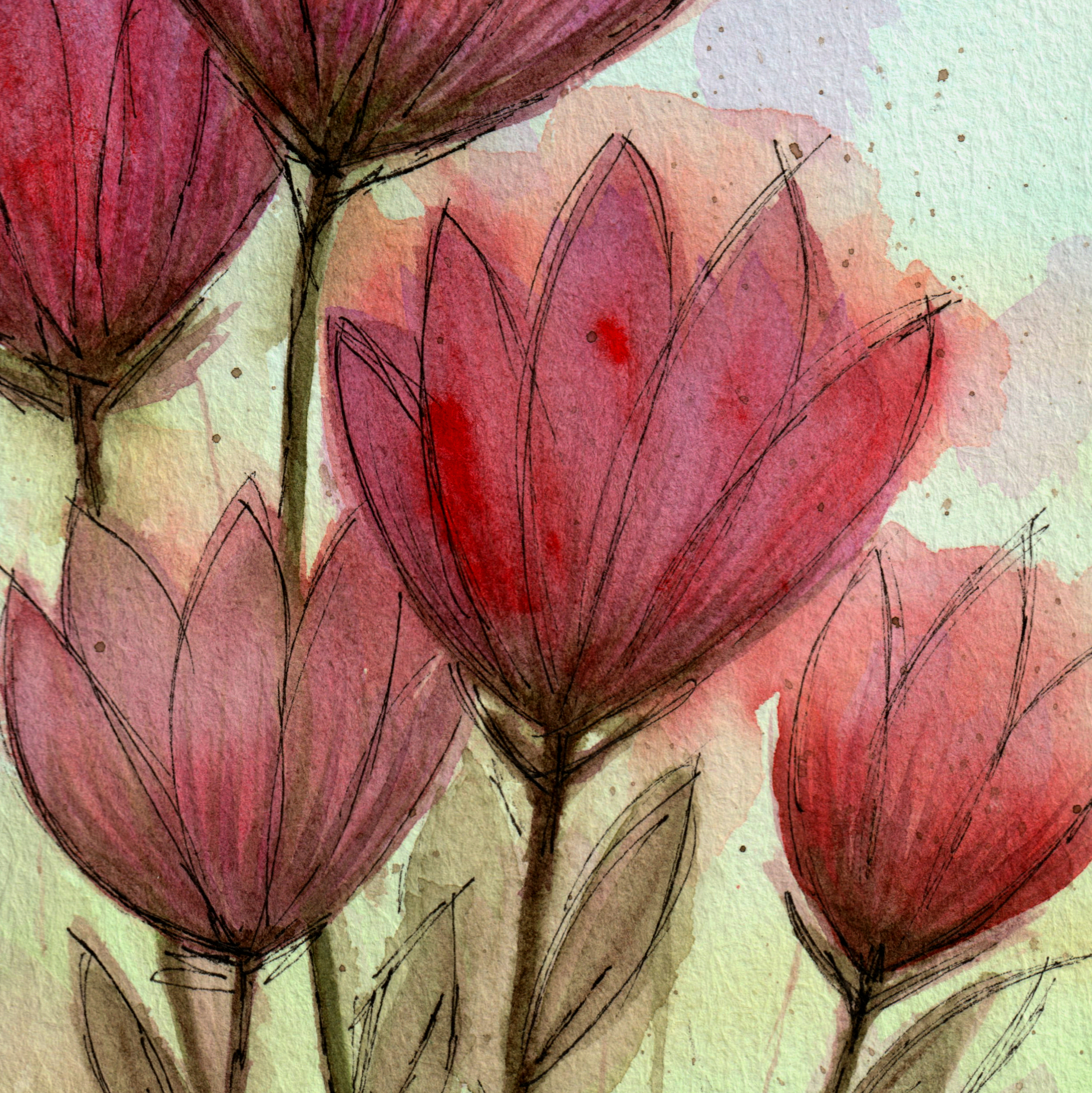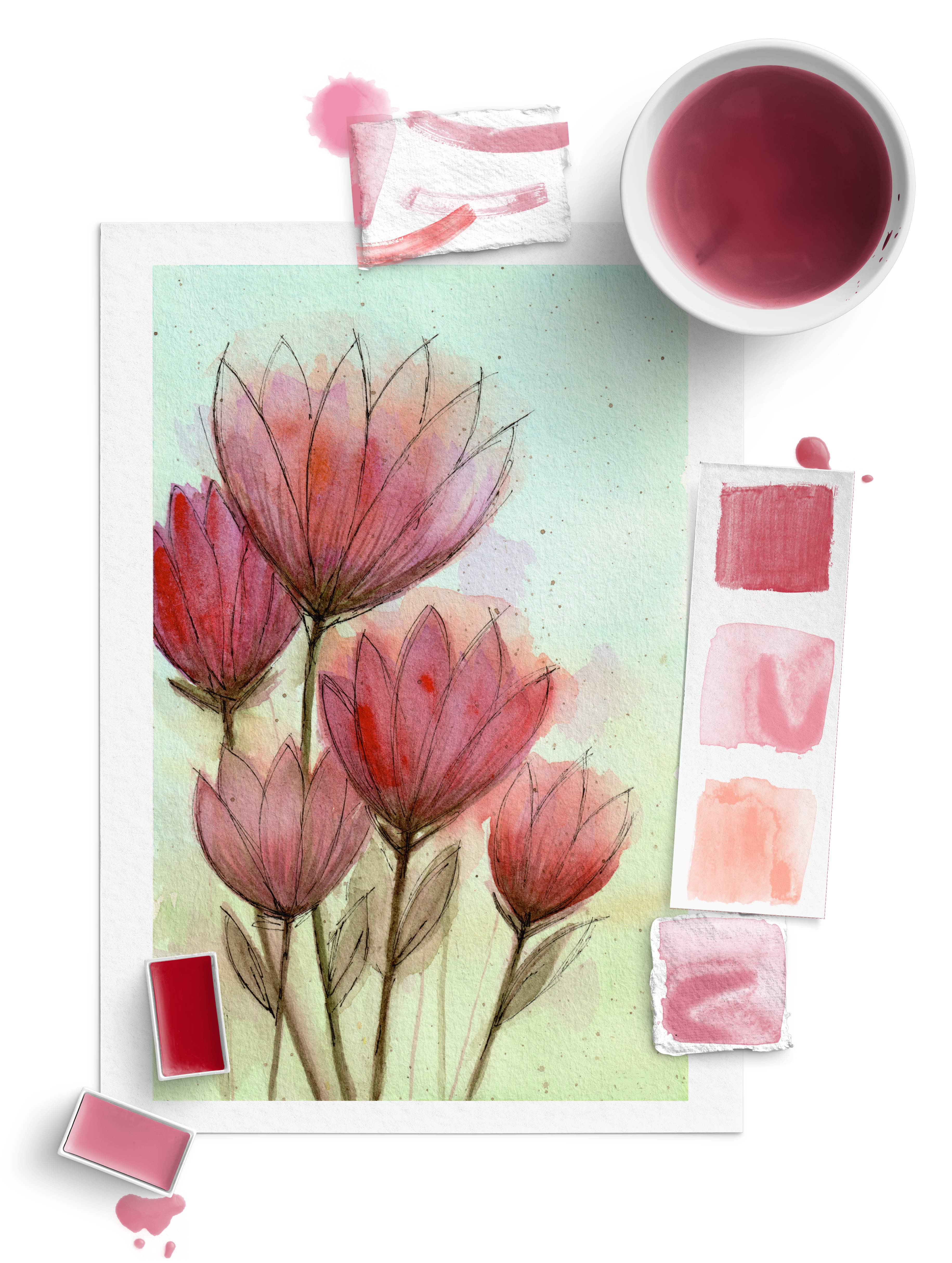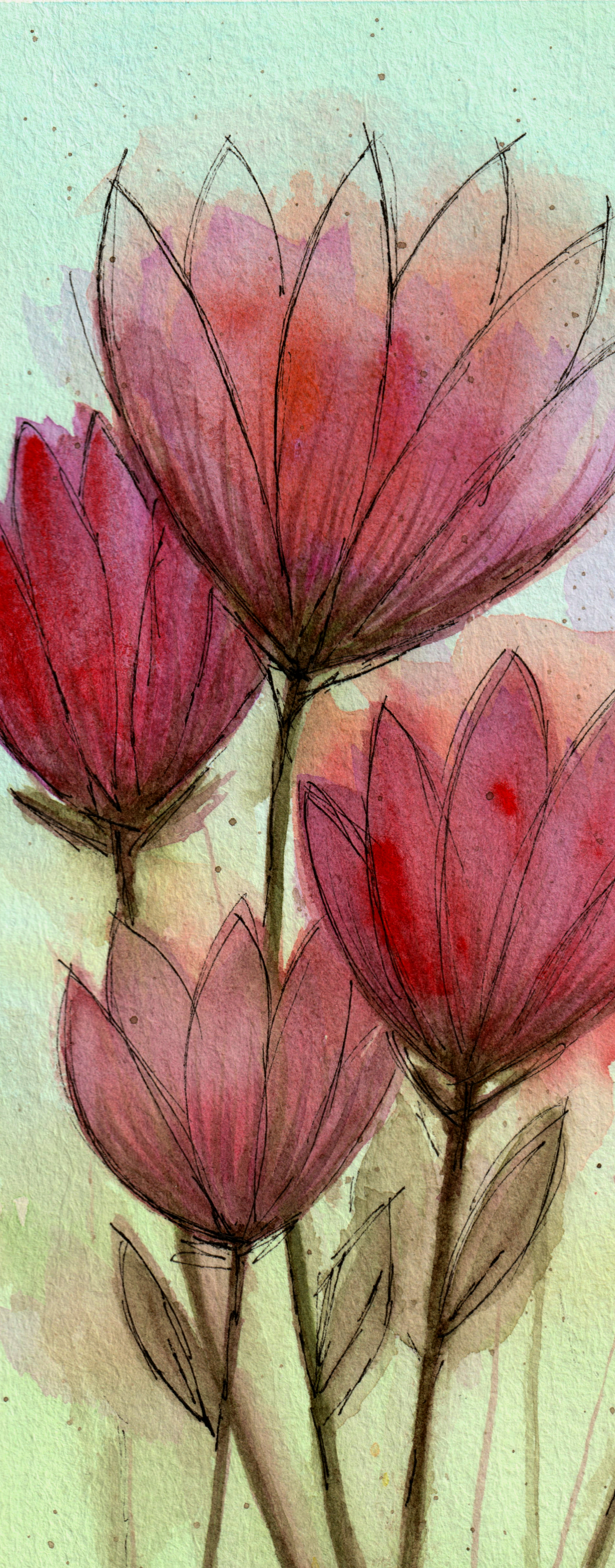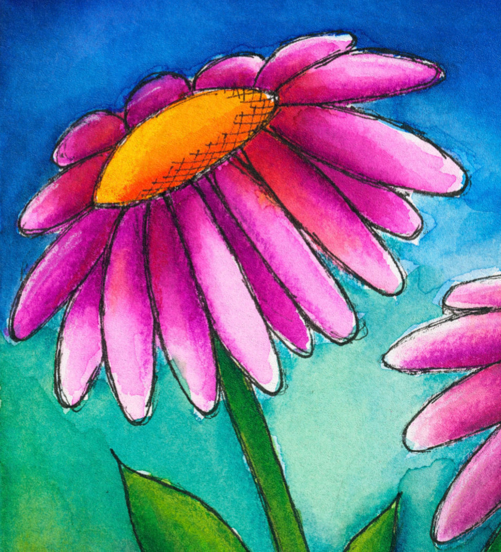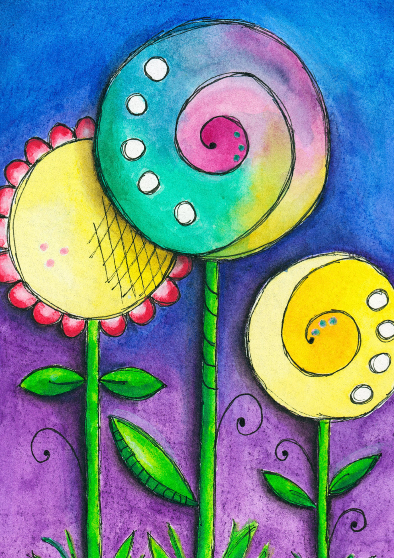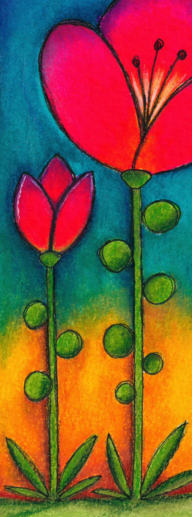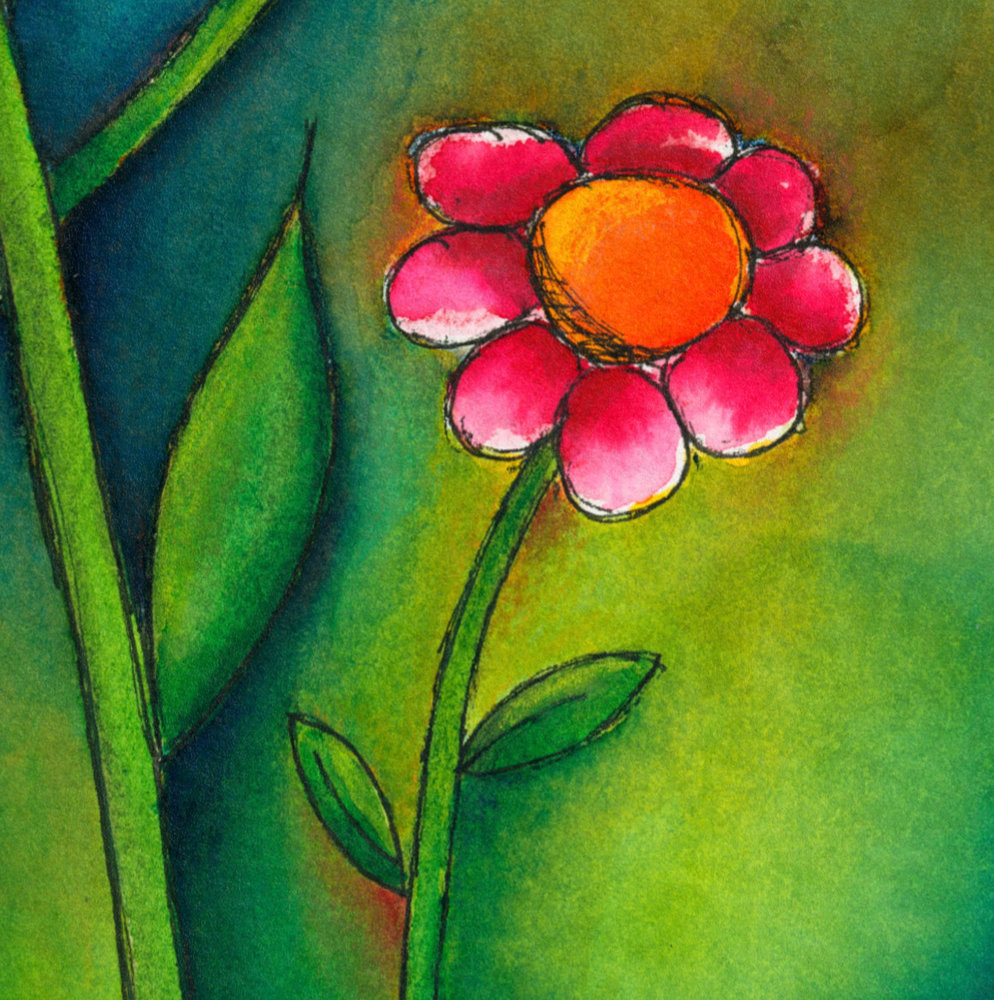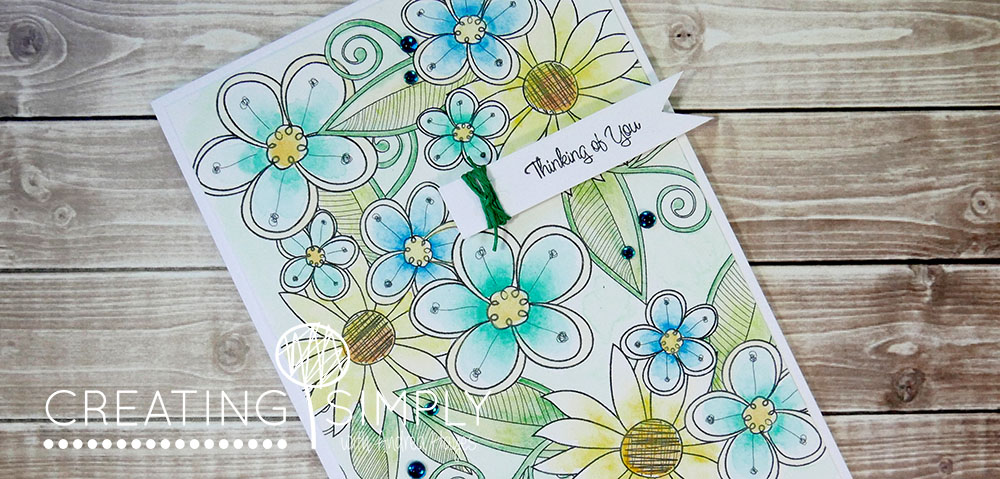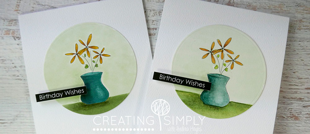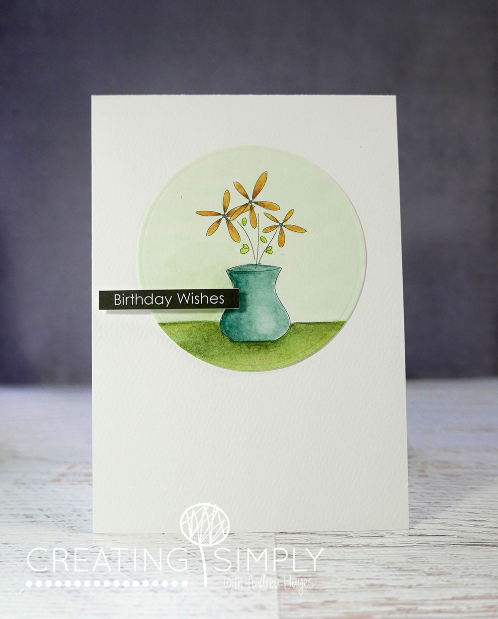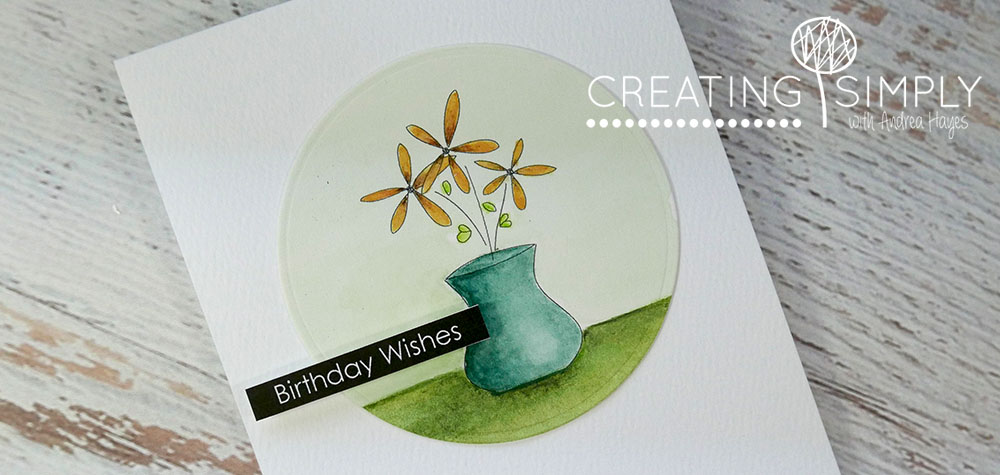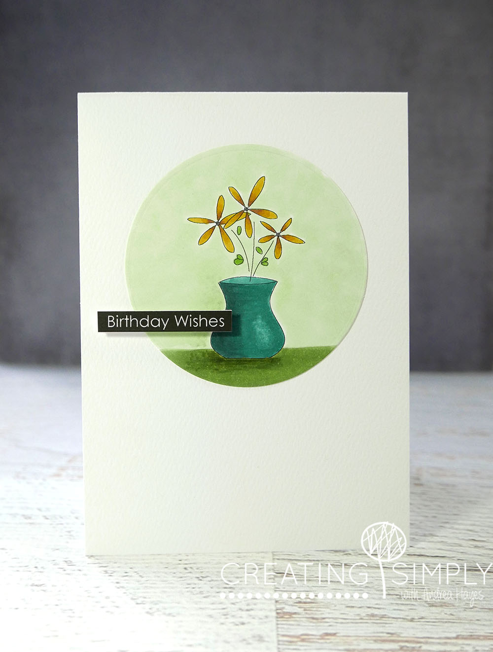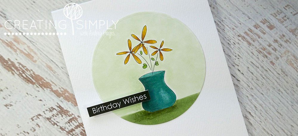
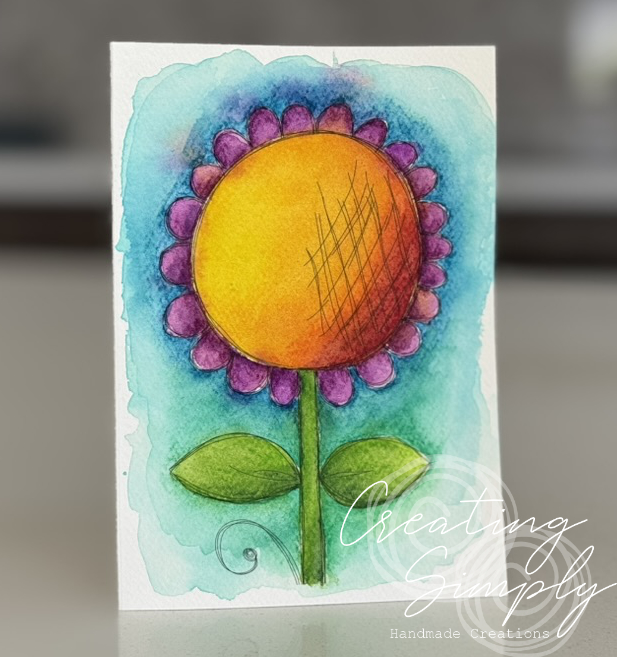
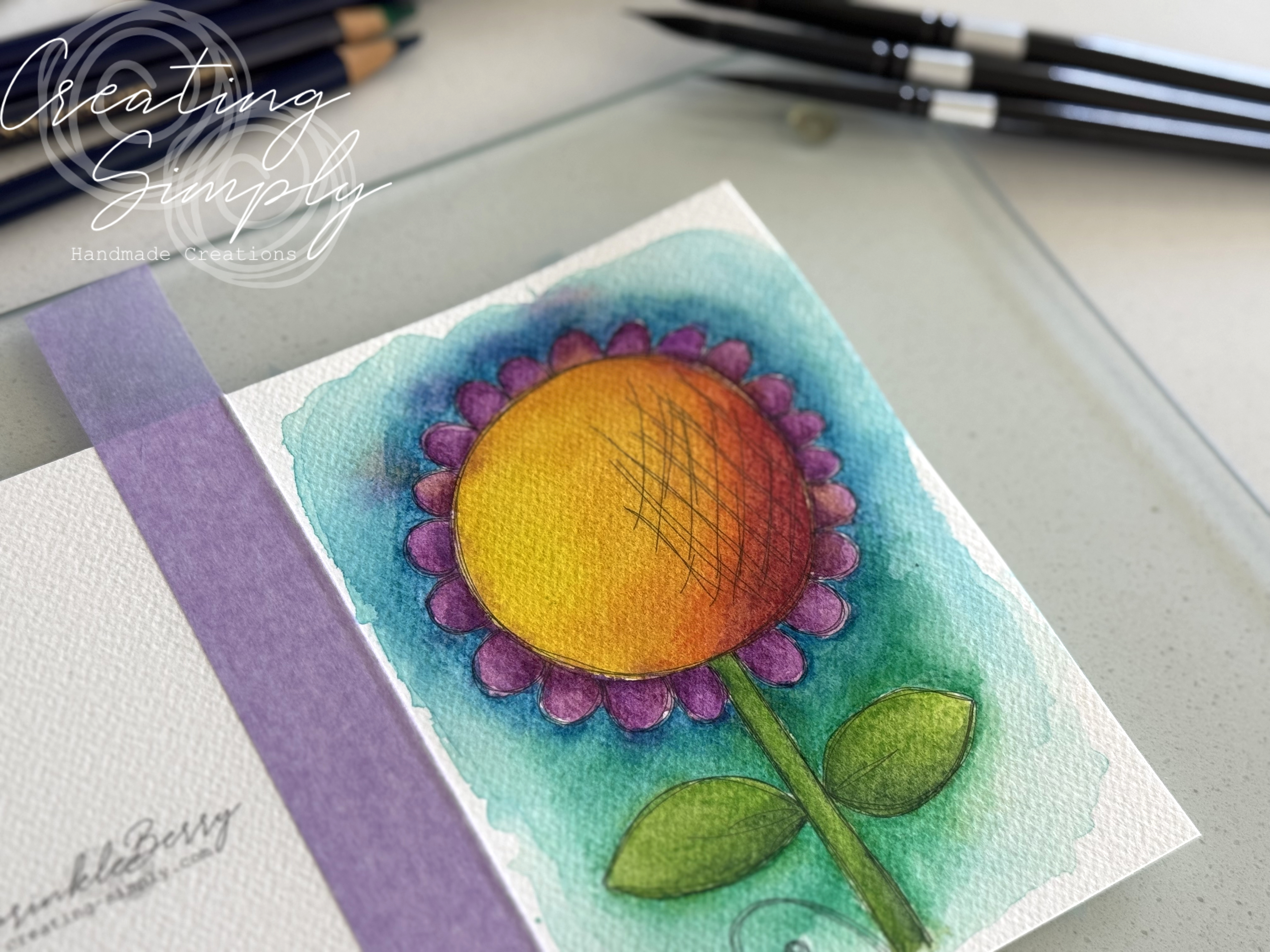
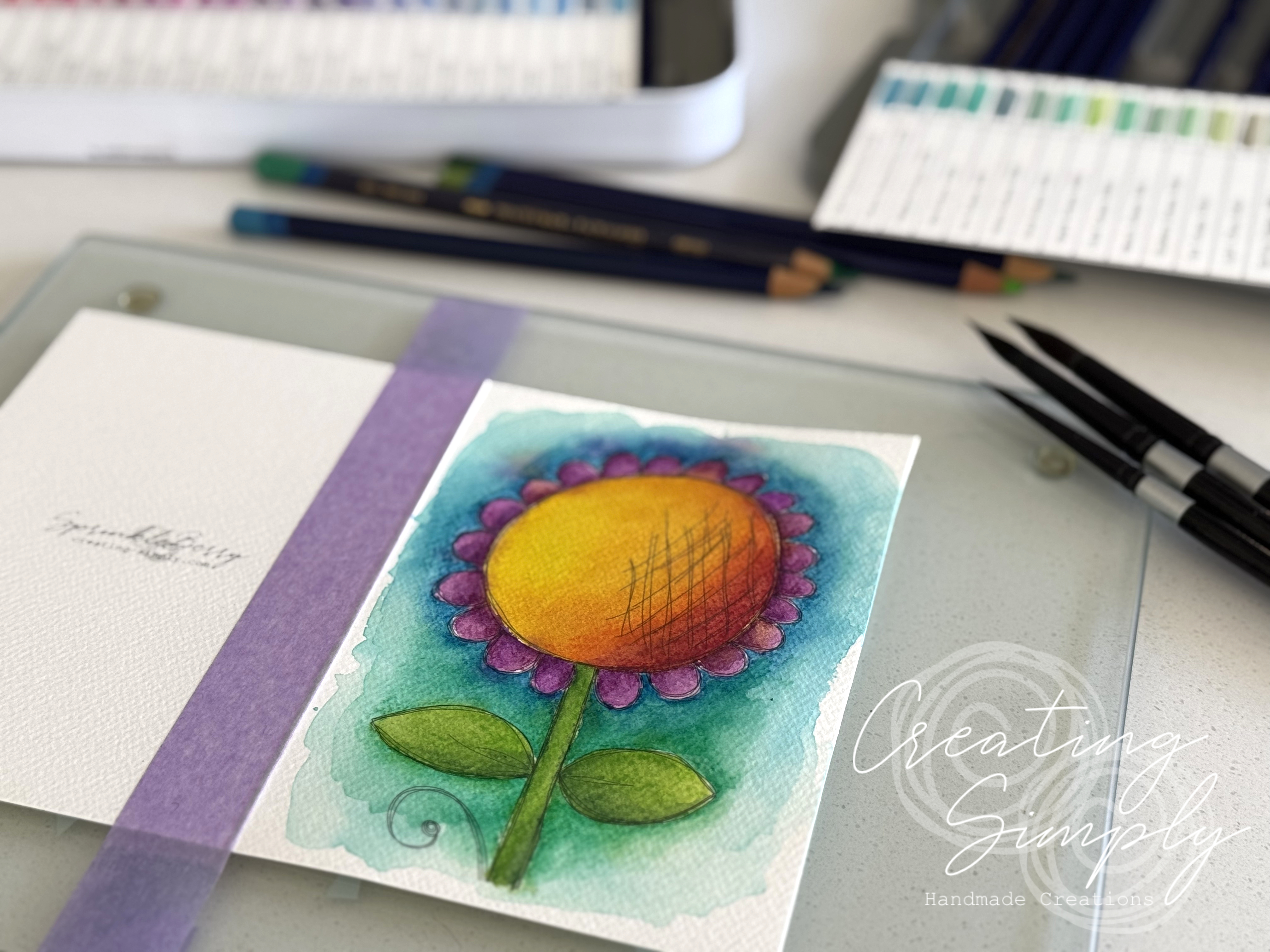
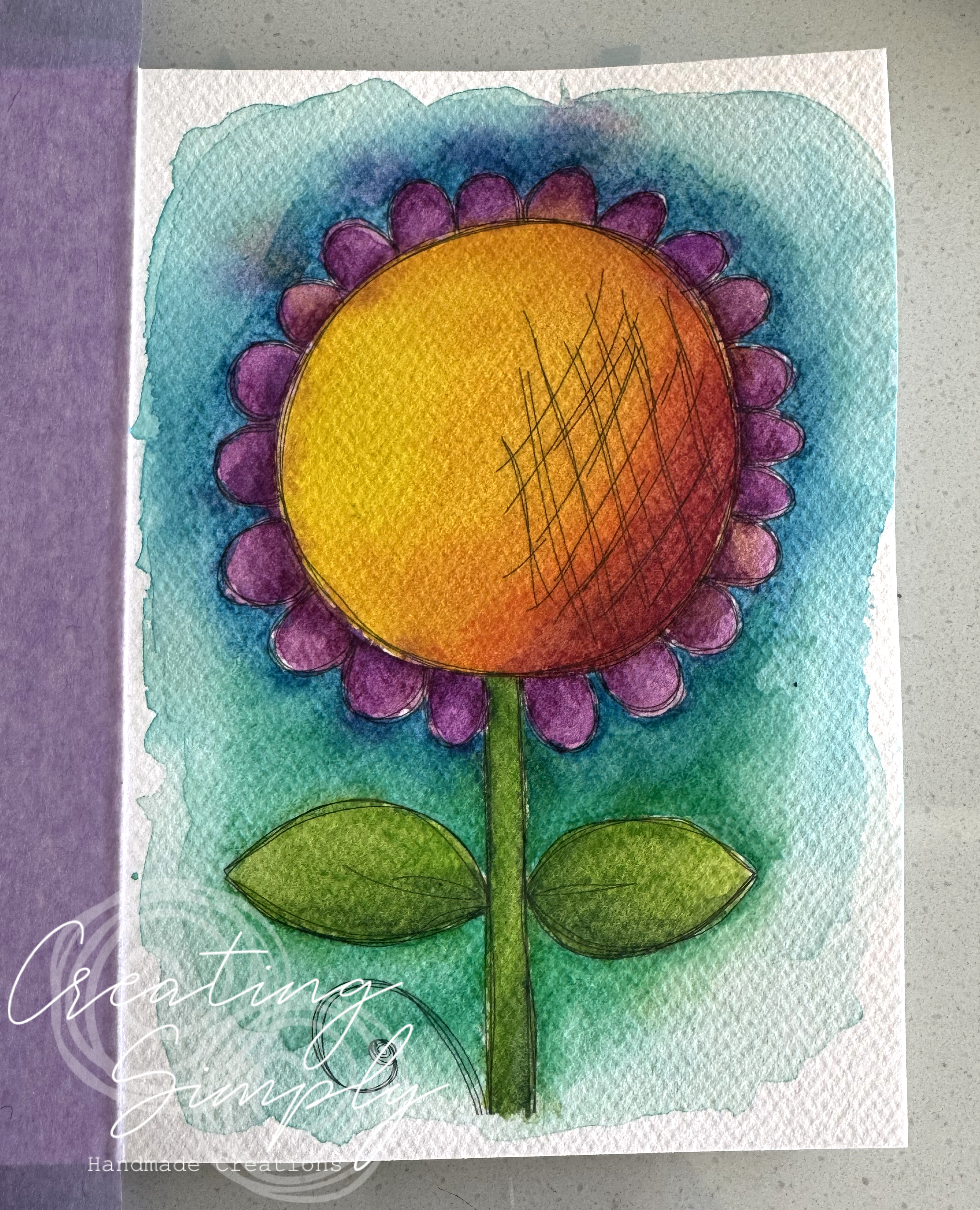
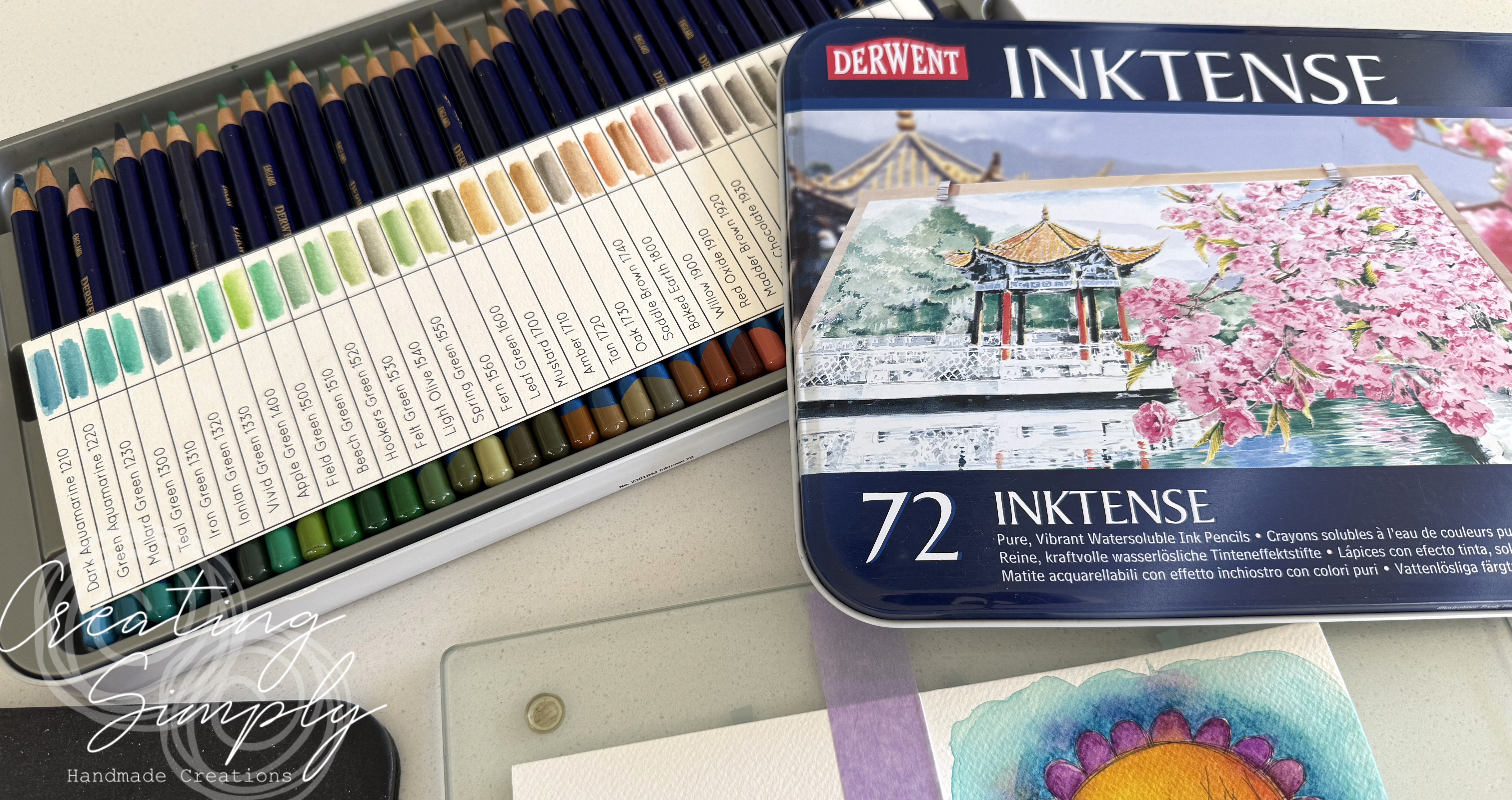
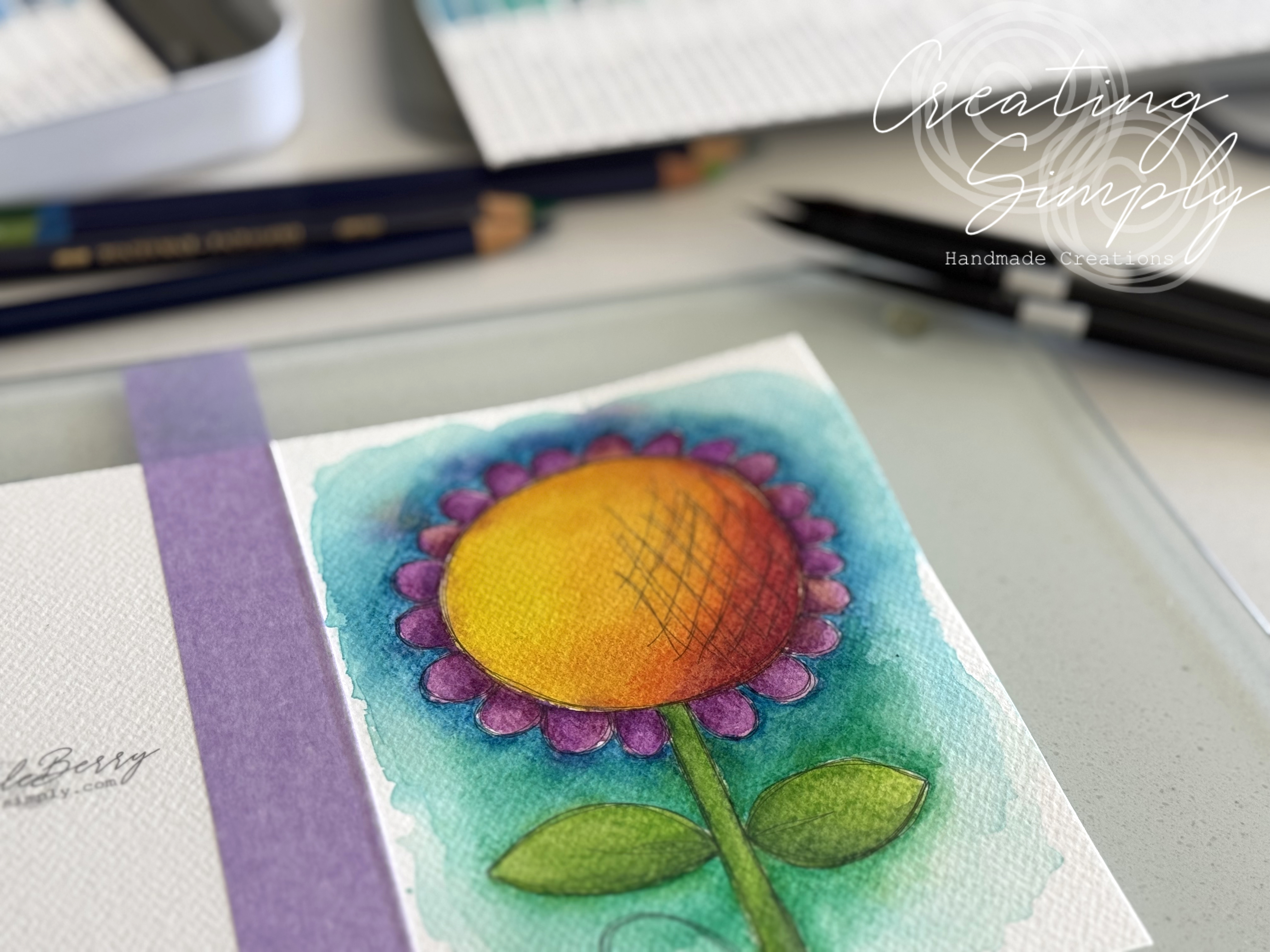
I love Derwent Inktense pencils and have for a very long time. They never disappoint with their beautiful bright colours and the ability to continue to add color, that dries permanent, over the top, making little ‘tweaks as much as you like.
I took the card I made the other day and added additional depth of colour over the top, and wow I love the vibrancy!
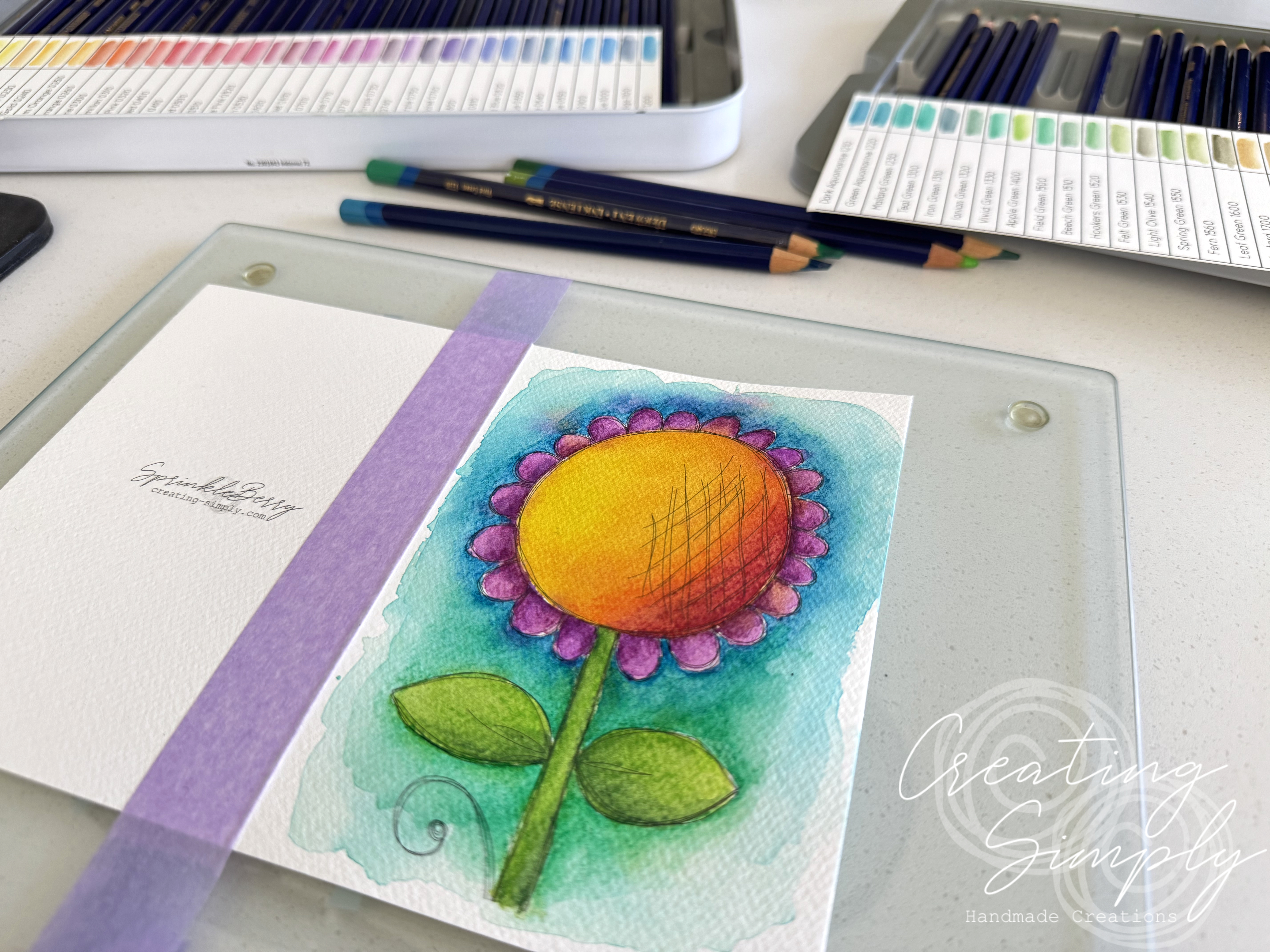
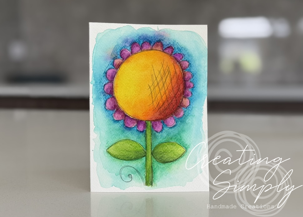
I made another quick video just to show how easy it was to add color using these amazing pencils. The video is nothing flash, has no voice over or written words and is at 4x speed, but hopefully it may be useful for some. This flower can be found on my Etsy and Payhip Stores.
Thanks for stopping by.
Smiles,
Annabelle