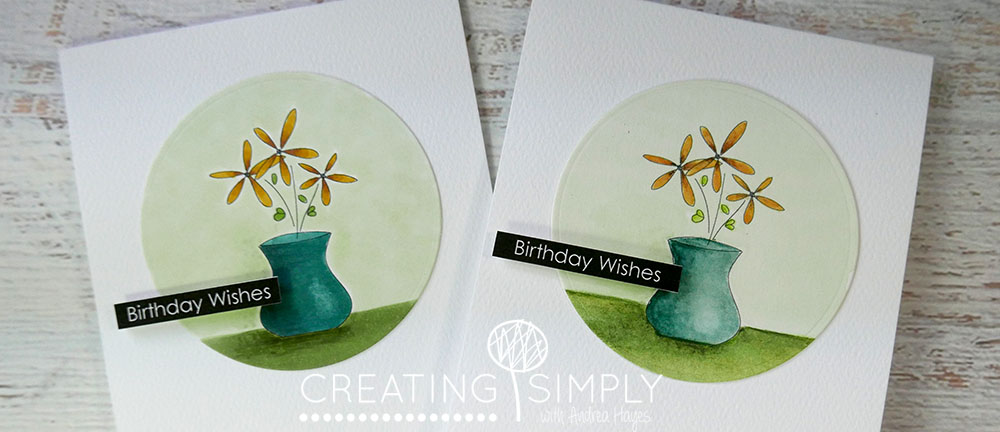
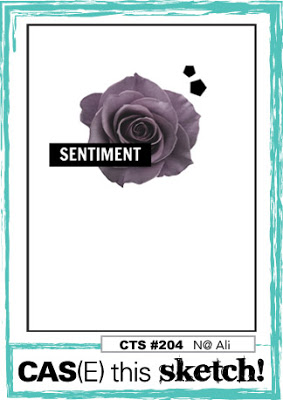
I loved the simple sketch at CAS(E) this Sketch this week and have had it sitting on my desktop for daaayyys, so today I got around to doing something about it! I wanted to use both Copics and Inktense and have tried to match the colours as close as I could just so I could see the differences.
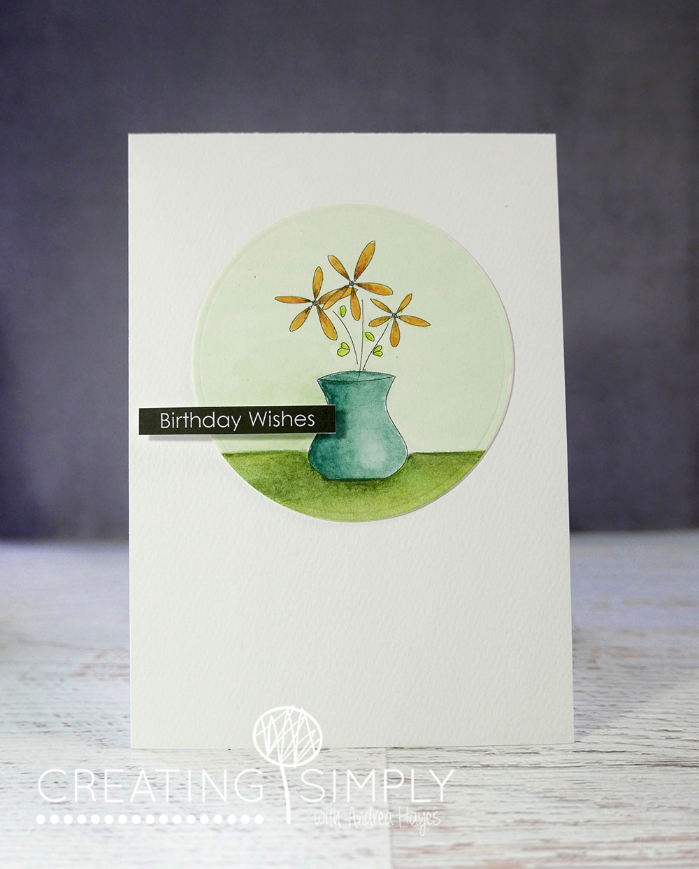
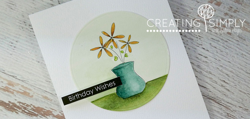
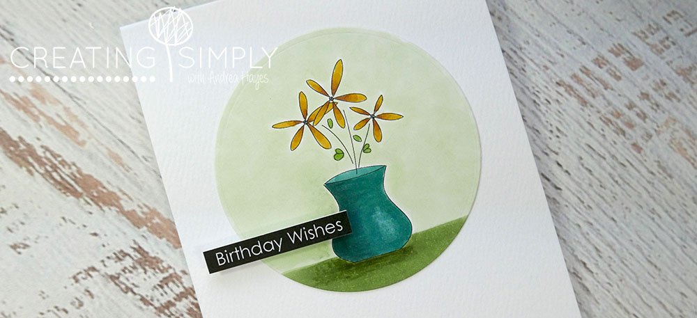
This one uses Inktense pencils. The light background at the top took mixing 3 colours to get something close to the colours I used in the Copic card, but I came pretty close with that I think. To me it looks like a watercolour card and not smooth like the Copic, but then I liked the Copic as well 🙂
The Copic card actually took a lot less time because I didn’t have to wait for anything to dry.
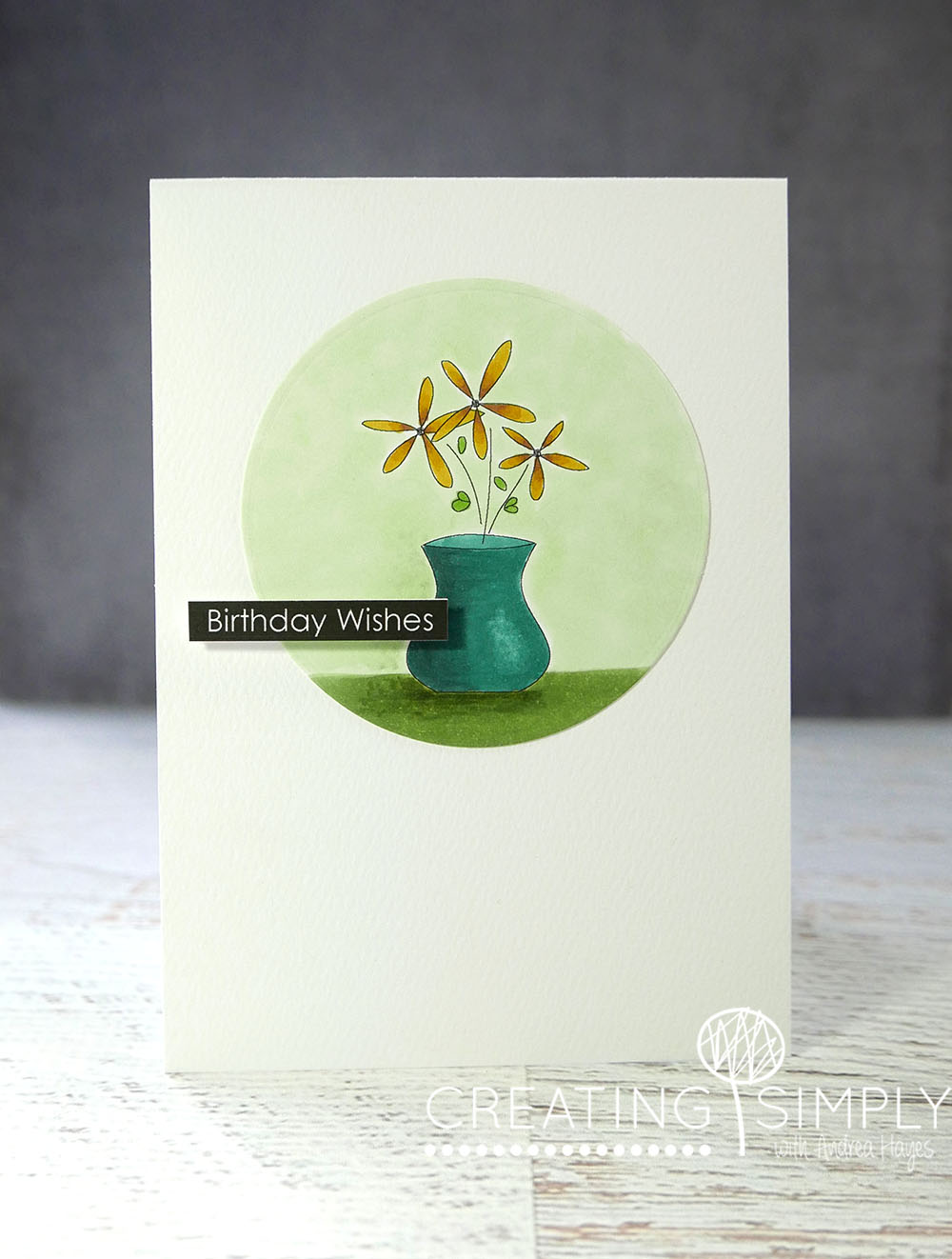
Not good lighting in my office today so it was hard to get a good shot, even with three lamps going! The image is from the Flowers For You set but I’ve used the digital version (coming soon) and scaled them larger to suit the card I had in my mind. The sentiment I created and printed at the same time as I printed the image out.
Here’s the sketch and I hope you enjoyed the comparison 🙂
Smiles,
Andrea

Pingback: Watercolour Background |